Design Thinking for Social Innovation
If I’d asked my customers what they wanted, they’d have said ‘a faster horse.’
– Henry Ford
Last week was the first week of our Human-Centered Design course (provided by ideo.org and +Acumen). We were tasked with finding a group of 4 people, and to come up with a name and a logo for the group. We were so excited when we finally decided upon the name Rascal Studio and wrote a little mission statement, which I think encompasses the fun and playful vibe this group seems to have.
The Rascal Studio mission statement is:
We are Rascal Studio, made up of four Vancouver-based rascals who went rogue. We believe in bringing clever ideas to drive social change in our community and around the globe.
Yes, it rhymes.
I had only met one of my group members before (at Wordcamp Vancouver this summer) and we had kept in touch through Facebook. She is a graphic and web designer named Amelia. When I learned about the course, I got pretty excited and contacted Amelia right away to ask if she wanted to help me form an A-Team of terrific people to complete the course with. She said she had two people in mind for this almost immediately, and she asked them and they both agreed to join us. Obviously I was nervous, never having met the two other people, but I could not be more happy with my fellow group members. Rascal is made up of myself, Amelia, Jen, and Susan.
Here are some pics of our first A-Team meeting for happy hour brainstorming at Rogue Wet Bar:


Just a little about human-centered design, because I wasn’t sure what that meant until last week:
Human-Centered Design is design that is used to create innovative, effective and sustainable solutions for social change. It’s a process that starts with the people you are designing for and ends with new solutions that are tailor-made to suit their needs. As you can imagine, this process relies upon tons of user-testing, and sometimes both the problem and the solutions might change several times throughout the iteration process. It requires a deep knowledge of and empathy for the people you’re designing for, generating tons of ideas, and building and testing a bunch of prototypes. This design process can be applied to products, services, spaces, or systems. It is essential that we gain a deep understanding of the people we will be serving — not only what they need and desire, but what limitations they face, what motivates them, and what’s important to them.
Some examples of Human-Centered Design problems might be:
- How might we design a cookstove that reduces the amount of smoke inhaled by a person while cooking?
- How might we design new services engaging low-income parents in after-school education for their children?
- How might we design hospital waiting rooms to mitigate the transmission of airborne diseases?
- How might we redesign the common areas of a community housing structure to engage connecting and cooperation among neighbors?
- How might we design a system linking social entrepreneurs from around the world?
One of the limitations or weaknesses that we could see with this design method would be that it probably isn’t very budget-friendly, and also solutions would have to be quite culturally-specific. Where to focus our efforts is an interesting dilemma, and opened up some compelling debate about whether we should focus on local issues or seek out issues in other countries that we feel may be more in need of help. We don’t have to decide right away, as we will be working on smaller assignments first.
For our first workshop, we congregated at a meeting room at the Central Library.

Our little meeting room.
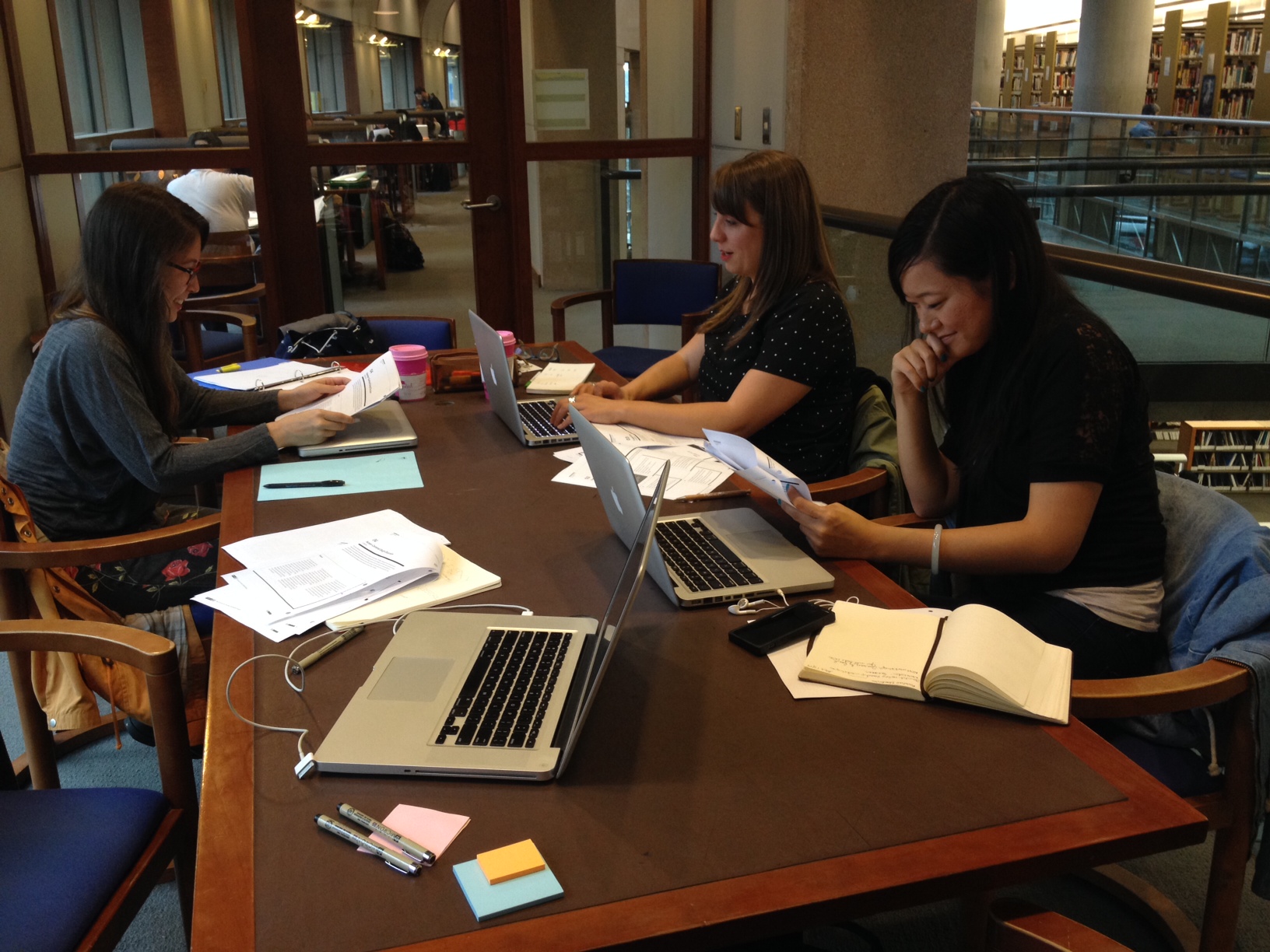
The study group that will take on the world!
Our first mini-assignment was to design a better commute. We went around the table and each shared some nightmare commute stories, and we realized pretty quickly that a lot of our stories involved incidents where our personal safety had been compromised. This led us to brainstorm on what would make a safer transit experience.
The top three needs that we felt would contribute to a better commute were:
- Better transit safety & security
- More regular busses
- Better access to bus wait times (anticipated arrivals)
We came up with an idea for an app that would act as a fare card, and would provide GPS tracking information and specific bus location information, up-to-date bus schedules, street view, and emergency response functionality. In the event of an emergency, the app would notify transit security of your location and respond immediately. We thought it might also be useful to have the app connect to ferry and train schedules and information. There could be a section to add frequently used busses to a “favorites” list, that could notify you when your bus is close.
I had a chance to look at the existing Translink app, Next Bus, which provides bus departure information in real time, and it is quite limited.
We didn’t have time to prototype our app, but it was fun brainstorming ideas for it. I think the process helped us all get fired up about human-centered design, and get us thinking and ready for our next assignment this week!

Graphic Design extraordinaire, Jen!