As one of our final color theory assignments we were tasked with creating a poster in Illustrator that depicted a house or any kind of dwelling of our choice.
Here’s mine!
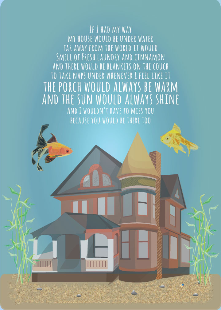
This poster illustrates several color relationships. The tetradic (double complementary) set of yellow, orange, blue and violet. I used analogous relationships for the fish: yellow, yellow-orange and orange. For the house, I used various tints and shades of the primary colors red, blue and yellow.
I used a muted color scheme and lots of shades and opacities to show highlights and shadows. I used a radial gradient in the background to indicate the light source.
I worked on the words quite a bit. I wanted to put something poetic on there, but couldn’t really come up with what I was looking for, so I opted for something still poetic but more childlike. I feel like the typeface expresses the mood of the words well.
