Our project for the quarter for our typography class was to perform a rebrand for a real company. We had our choice of four different companies. I chose Tval Skincare, an online skincare distributor based out of St. John’s, Newfoundland, Canada.
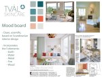
When I thought about St. John’s, Newfoundland, I thought of weather. When the project was assigned, at the beginning of January, St. John’s had just been on the news for having “the storm of the century” — businesses and schools had been closed due to subzero temperatures and snow. I was walking through the park on my way to my car after class, my umbrella buckling against the wind, battling a little Seattle version of an ice storm. That got me thinking about protection from the elements. After all, that’s what any skincare product’s primary function is: to protect you from the sun, UV rays, the wind, and the cold. Then I thought — wait a second. The owners and operators of the company, a husband and wife, both have PhDs in biology. Then I thought of the periodic table of elements, and decided that my concept would be “Elements” as in, protection from the elements, as well as the periodic table, and the science behind the manufacturing their skincare products.
![]()
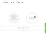
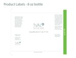
I made the custom typeface for the logo typeface and “Clean Body Butter” letters, and the “blossom” in the logo is a drawing I made of an atom, raised ‘to the power of’ the Tval Skincare name. My mood board and concept incorporated the five elements: earth, water, metal, fire and wood.
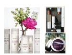
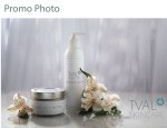
A special thank you to Sean Balko, product photographer extraordinaire, for doing an amazing job of my promo photo. I am still completely blown away with his finished product, not to mention his outstanding professionalism. Even though he was doing me a tremendous favor, he treated this project with professionalism and integrity. Thank you so much, Sean. I owe you a big one!
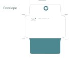
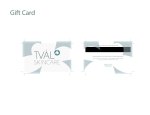
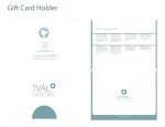
Here are my slides from my final presentation.