Renton Campaign – ad comps

I am happy with how this project is developing! I have secured a photographer, Elizabeth Ogle, who is very excited to be contributing to this project. I wanted to collaborate with her because of her use of bright colors, animated, gestural poses and most importantly, humor in her portfolio (www.elizabethogle.com). And since humor is at the core of my concept, I knew that I needed a photographer who understands the joke. Luckily for me, she accepted the challenge!

Elizabeth and I met last Saturday morning at a cute little coffee shop in old downtown Renton (Common Ground Coffee & Cupcakes), and I shared my ideas with her for the photo shoot as well as the video. We battled the blustery weather over to the museum and met some of the people who work there, who are always super friendly and full of wonderful information. We drove around and did a little location scouting afterward and I took her to the Cedar River to see the salmon spawning.

Turns out, Elizabeth knows some people who might be interested in acting in the video and being models for the shoot. They are unemployed and keen to be compensated with six packs of PBR tall-boys. We have requested their participation and are awaiting their reply.

Here are some further refinements of the ads for the Renton campaign, with some comps of what they would look like in actual advertising scenarios.

Chris-BusAD

Chris-BusSTOP bus-stop-poster bus-back-ad

The video component of this project would consist of 2-3 short, 30 second television commercials, which would air on JoeTV in the evening from 6-8pm alongside Vern Fonk, The Jewelry Exchange and other local commercials. The ads would show the beauty of Renton, juxtaposed with the humorous perception that people have of the community. The interviewer would be off-camera, asking the actors questions about the history of Renton and the Renton History Museum, and the actors would reply with ridiculously inaccurate responses. This is my rather simplistic storyboard for the concept of the ad.

Renton-Storyboard

We won’t likely be able to start shooting for another week or so, but we are both chomping at the bit to get started on this. I think the outcome will be hilarious.

Generational Health First – week 6

Due to technical glitches with Hostgator over  the past week, progress has been slow on the coding side. I have re-started the GHF homepage several times, trying various themes and approaches. Due to hosting conflicts with required plugins, I am unable to continue coding the theme I have chosen, Pytheas, so I have decided to code the site from a subfolder on my personal domain and move it to the GHF site once it is completed. In the meantime, I will have to convince the client to move their domain to a host that will support this theme (I have installed and tested the theme and all required plugins on another host and it works perfectly there). Since my personal domain is in the midst of a transfer to Blue Host, all web coding is on hold but it seems likely it will be back up in a few days.

Originally, I had decided to take a more agile development approach and wireframe as I was coding. I felt that this would be better suited to illustrating to the client exactly what the site will look like. This pause in development has provided a nice opportunity to prepare some more detailed wireframes. This is the wireframe I have prepared for the homepage.

GHF-wireframes-HOME

As you can see, my wireframes are a pretty basic interpretation of the structural elements of the theme, but this was useful in determining how the client wants the content to be structured and for placement of specially requested items (eg. the client asked to have double-navigation — a second navigation bar at the uppermost portion of the screen, just above the logo).

Screen Shot 2013-10-29 at 8.01.10 PMScreen Shot 2013-10-29 at 8.01.25 PM

I shared some more refinements of the logo with the client last week. They liked #2 the best, which is the one I liked the best as well. I was instructed to further refine #2 and to provide final comps with more color and typographic approaches.

GHFlogos-comp

Aside from the domain hosting glitches, the project is on schedule. I am aiming to have the logo completed in the next week, and the basic framework of the site built for the end of the quarter. I predict that I will be refining the site into next quarter, which the client is okay with as they are still working on creating content.

Generational Health First – week 5

Last week, I installed Starkers and began to build the GHF homepage. Things were going pretty swell, albeit slow. But then, all of a sudden, Erik taught us about parent / child themes in interaction class, which blew my mind because I knew that this could potentially make building this site a lot easier.

Since the onset of this project I have been a little concerned with keeping on schedule and being able to meet the fairly tight timeline I have created for myself. I know that I could build this website from scratch using Starkers, but I was not sure if I would be able to see it to completion by the end of the quarter. So, in an effort to keep this project on schedule, I have decided to use a customizable theme for the Generational Health First site. It took quite a bit of research but I think I have decided upon using Pytheas, which is responsive (of course) very customizable and already looks close to what the client said he is looking for. It looks organized and clean. Here are a couple of screen shots of Pytheas:

Screen Shot 2013-10-29 at 8.01.10 PM Screen Shot 2013-10-29 at 8.01.25 PM

After the client reviewed the logo iterations I sent, he indicated that he liked the look of the three letters all connected. Here are some further iterations of the logo.

GHFlogos2

I want the logo to express the layers of multi-generations and passing on of information from one generation to the next. I am sure a few more rounds of drafts are to come, before the logo is finalized.

I also opened an account with mailchimp last week, to aid with email newsletters that the client would like to distribute in the future.

Ad campaign: Renton. It’s not what you think.

Here is my mood board for the my promotional campaign for the City of Renton.

Renton Mood Board

We did our initial planning shoot today and I got some video (the audio isn’t good, but it’s pretty funny and captures where I would like to go with this project):

I would love to do a short TV ad, as well as a poster campaign. I am not sure about the third piece yet. I have a photographer lined out who is very excited to work on this project.

And here is my initial shot at layout:

RentonPoster-Chris

RentonPoster-Michelle

RentonPoster-M&C

Seattle Central T-Shirt Contest

This is a design I made for a contest to design a shirt for our program. Immediately as soon as this project was due, I got sick with a terrible cold. In my delirious state, I had a detailed dream wherein I won the contest. In real life, once the fever cleared, I did not win. Oh well, at least I am rich in spirit and my mom thinks I’m cool.

SCCA-T-Shirt-web

GHF – Revised Style Tile & Logo Iterations

After my discussion with the client last week, I decided to refine the style tile to make it look a little more modern and fresh, and to incorporate some of the client’s wishes. Here’s version 2 of the style tile for Generational Health First. It is still very much a draft and a work in progress. I am just trying some different style approaches. I feel like it is going in a better direction.

GHF Style Tile-ver 2

For the past week, I have been working on sketches for the GHF logo.  Here are some of my sketches and the electronic version of the initial drafts. I am expecting that the logo will go through many more iterations before we make a final decision.

GHF-sketches-1GHF-sketches-2GHF-sketches-3GHF-sketches-4

GHFlogos

I have another meeting with the client today, during which he will provide feedback on the updated style tile and logo ideas. I will proceed with finalizing the wireframes this week.

Generational Health First – week 2

As I mentioned last week, I am working on branding for my special projects assignment. I love branding and marketing, so I am very excited about this project. I have chosen to create a look and feel, brand, and WordPress site for a naturopathic doctor. He has written a book, which is in the editing stage now, but the client would like a book design and e-book in due course.

We signed the contract last week and I had my second client meeting last Friday. I realized last week after talking to Marc that I need to work on bringing more energy and confidence to these meetings. I basically need to learn to sell the client on my abilities as a designer, as they have hired me with zero prior knowledge of my skill set, and have some legitimate concerns about my abilities.

We made some good progress on what we like & don’t like about the initial style tile. This gave me a good insight on what the client is looking for from a style perspective and made me feel a lot better. The client is open to other typeface treatments for the logo and I will choose several for him to choose from. He has indicated that a non-typographic logo may not be necessary, but we may revisit this later. We agreed that the length of the title creates challenges from a design perspective, and discussed focusing on “GHF” for the logo instead.

This week, my deliverables will be to provide the client with some alternate typeface treatments for the logo. We discussed the wire frames and I explained some content strategy techniques, specifically, how to use blogging and guest blogs to keep the site active, and designing from the “content out”. Thankfully, we agree on all the suggestions I made, so I feel ready to get started on the site map and wireframing in the coming week.

I am taking an agile approach to this project, but am on target with the established timeline:

Sept 23 – 28 – Establishing / Pitching project idea

Sept 29 – Oct 5 – Establishing look and feel – brainstorming – color palette & style tile

Oct 6 – 12 – Logo development & Typography treatment

Oct 13 – 19 – Finalizing Logo and overall look and feel

Oct 20 – 26 – Sitemap & initial sketches (some existing wireframes already prepared by client)

Oct 27 – Nov 2 – Begin developing wireframes

Nov 3 – 9 – Finalize wireframes

Nov 10 – 16 – Begin uploading content to existing WordPress theme

Nov 17 – 23 – WordPress

Nov 24 – 30 – WordPress

Dec 1 – 7 – WordPress

Dec 8 – 14 – Finalize WordPress site

Special Projects Assignment

For my special projects assignment, I have chosen to work on branding and marketing for a start up company. It is a unique situation. A friend knows a naturopath who has written a book on health and wellness, and needs a WordPress.org site to promote the book. The client will need a typographic logo, overall look and feel, site map, wireframes and a WordPress site. The client has already purchased a domain and provided a theme, to use in the event that we do not have time to do a complete responsive WordPress redesign. Partial wireframes have been provided by the client for structure purposes.

Content is limited at this point. I suspect some marketing copywriting may be required, as well as weekly content for blog entries. The largest challenge I can anticipate with this project will be restructuring the content for the web. The client has indicated that he wants the website to act mainly as a squeeze page, but has also indicated that there is potential for a lot of content and his wireframes include a lot of header tabs.

Wikipedia, on squeeze pages:

A squeeze page is a single web page with the sole purpose of capturing information for follow-up marketing; that means NO exit hyperlinks. Quality squeeze pages use success stories that the prospect would relate to when making a buying decision. They also use things like color psychology, catchy sales copy and keyword rich text placed with SEO. Some advanced marketers even use audio and video on their squeeze page.

Internet marketers borrow copywriting techniques from offline direct response marketing. This includes the use of a headline, bullets, teaser copy, deadlines, testimonials, scarcity, and the like. Aggressive marketers will present visitors with multiple incentives in exchange for their contact information.

As a general rule, Internet marketers try to keep the content on their squeeze pages to a minimum. The goal of the page is to obtain the visitor’s email address; additional information could distract the user or cause them to “click away” to a different website. Navigation and hyperlinks are almost always absent from typical squeeze pages. The absence of links is used to focus visitors’ attention on one choice: register for the email list or leave the site. Savvy internet marketers have discovered that convincing a visitor to sign up for an email list provides an opportunity to present that visitor with multiple sales messages over time, develop a relationship, and even cross-sell other related products.

Squeeze pages are often used in conjunction with an email autoresponder to begin delivering information as soon as the visitor confirms their email address. The autoresponder may be utilized to send a series of follow-up emails or to provide an immediate download link to get information. Promising information upon completion of confirming their email address has proven to be an effective method of increasing opt-ins using squeeze pages.

New technology has also led to adding voice or video to squeeze pages in an effort to capture the visitor’s attention.

A contract has been prepared and sent to the client for review and completion.

I have completed the initial version of the style tile and am awaiting feedback from the client. The next step will be completing a site map and beginning the wire-framing process.

The research process has been the major focus of the first two weeks of the project, as I needed to read the first 10 chapters of the book and do research on internet marketing.

Style Tile

Version 1 of the style tile, using ideas sourced during first client meeting.

Revitalize Renton!

It started as a joke.

A couple of years ago, I was driving past the Renton History Museum with my dad. I said, “I’d like to go there someday,” to which my dad responded, “The Renton History Museum? What do they have in there? A bunch of really old 6-packs of Rainier Lager?”

And we laughed and laughed… but I never did visit the museum.

I was intrigued by the architecture of the building, which has a distinctive Art Deco-style and is very old, but well-maintained. It looked really cool. It’s located in old downtown Renton, which is super retro and quaint. I thought about going down there many Saturday afternoons, but never did.

Renton Historical Museum

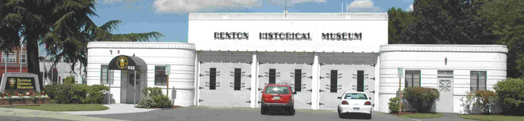
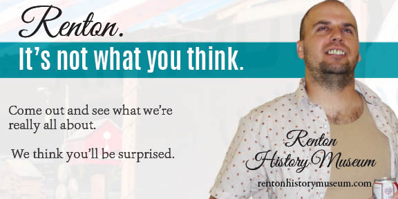
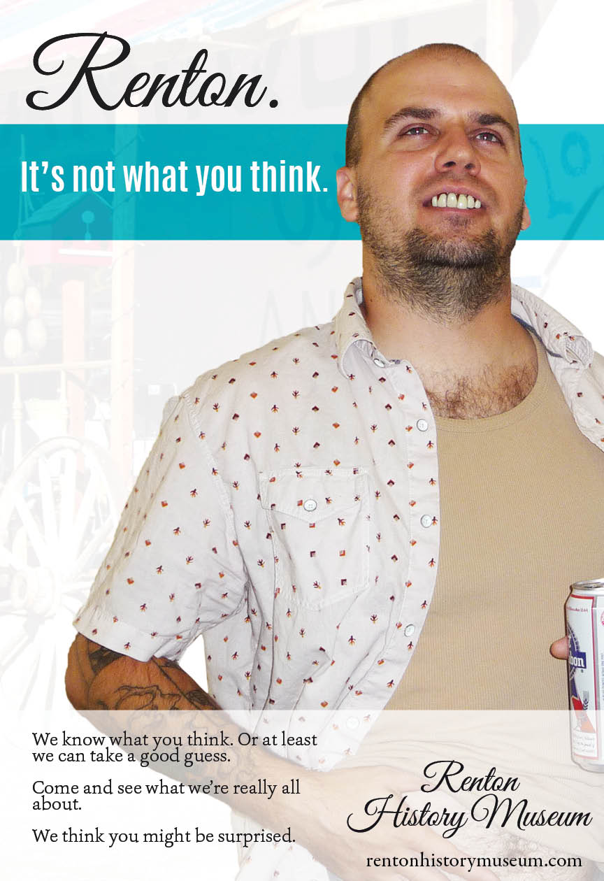
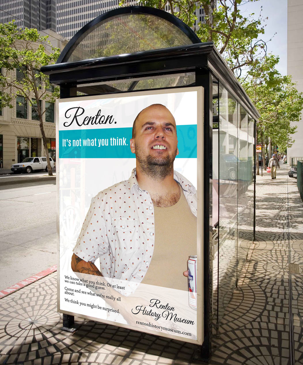
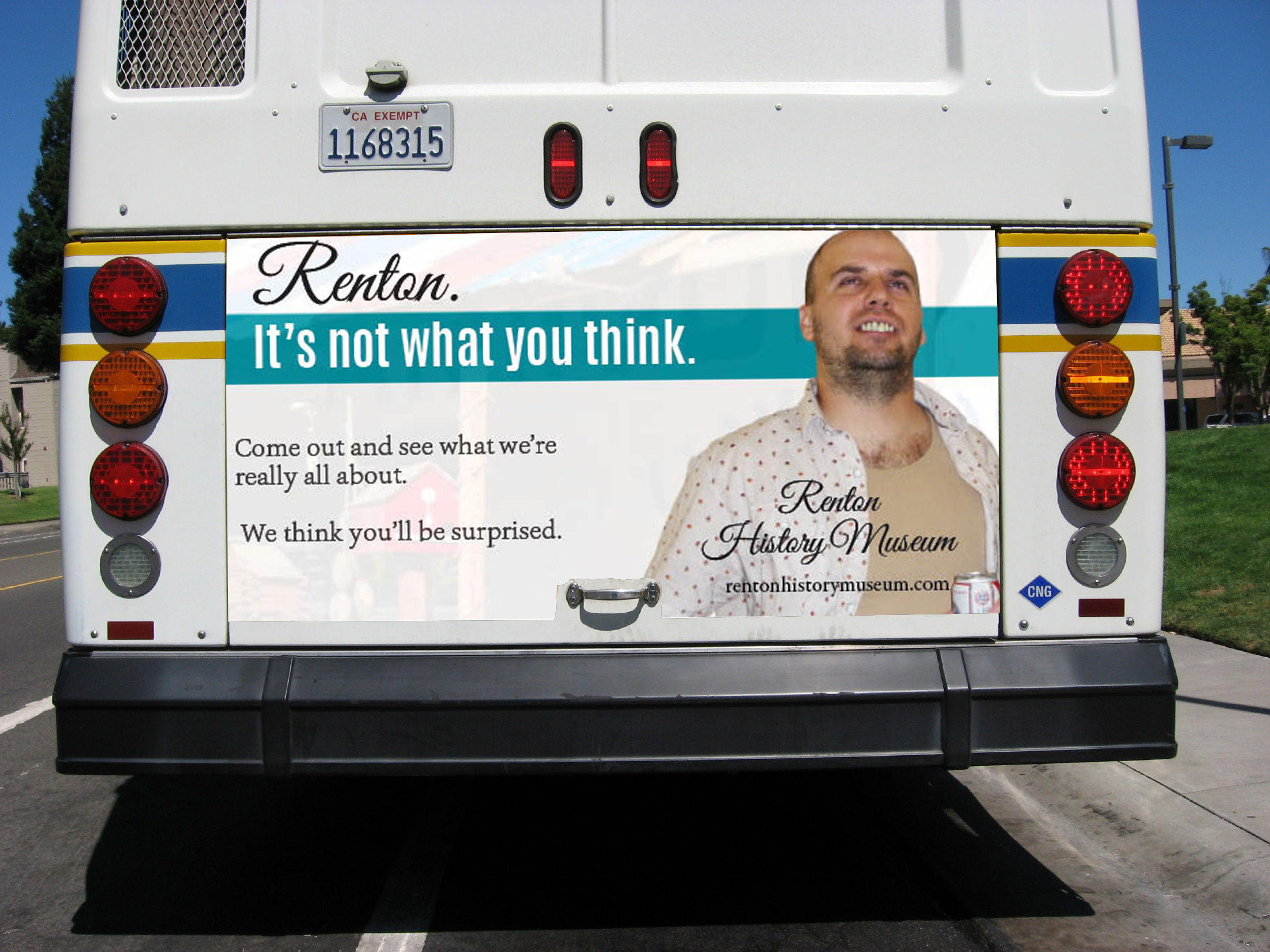
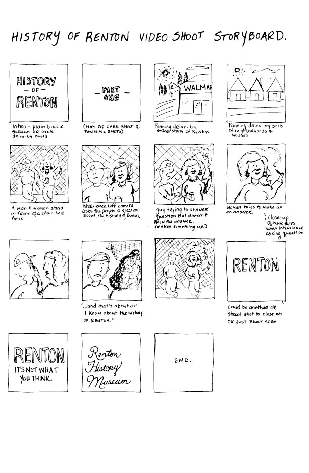
Last week, we picked our clients for our advertising campaign. We have been tasked with creating an integrated cross-media concept for a civic or public service cause. My choice was clear: I would promote the city of Renton, old downtown Renton and the Renton History Museum.

When I ran it past my teacher, he said the idea was hilarious.

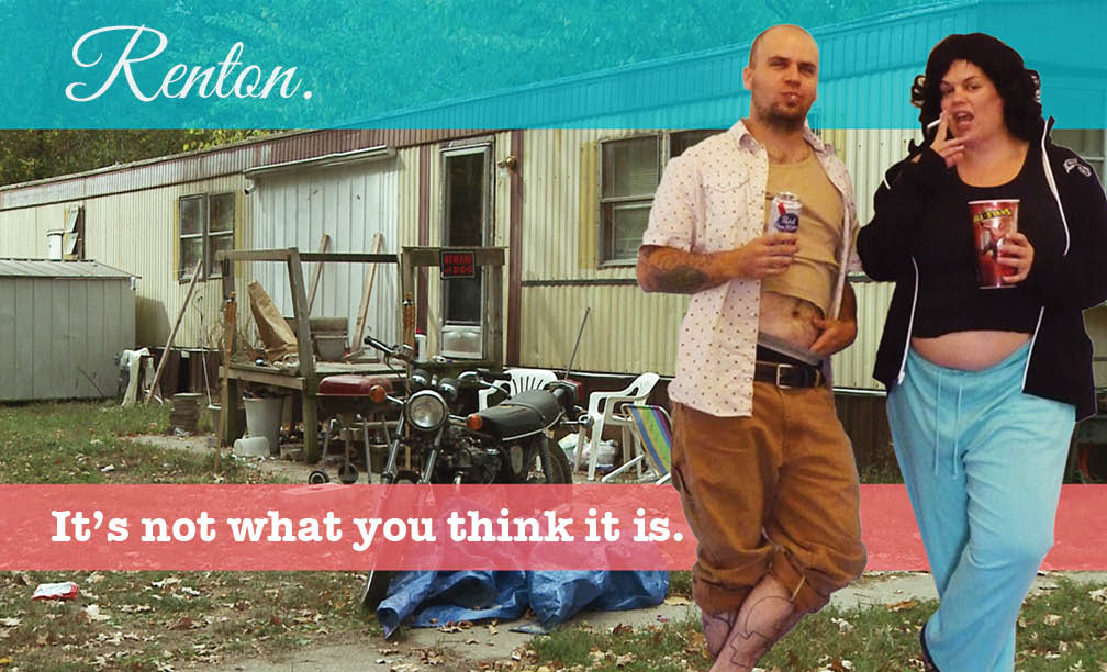
Lets face it — Renton’s reputation ain’t so spiffy.

Honestly, I don’t like to tell people I live in Renton. When I tell people where I live, they generally laugh or say sorry.

Since moving here two years ago, I am ashamed to say that I haven’t gotten to know my city very well. I like my apartment, I like my neighborhood, and I like that parking is plentiful and stuff is cheap, but that’s about where it ends for me. Before yesterday, I don’t think I have ever spent time exploring downtown Renton. And the reason for that is the same as it would be for anyone else: FEAR.

This fear is based on a pretty widely held perception that Renton is, at worst, violent and dangerous, and at best lame as hell.

At one point, I was so desperate for local social activities that, inspired by Fight Club, I seriously entertained the idea of joining Alcoholics Anonymous just for the social interaction.

This is a shame, because in my travels yesterday, I experienced some wonderful things. First of all, the old downtown Renton is really cute. There are some great coffee shops, old malt-shop-style restaurants and antique stores. There are lots of outdoor hangout spots. The Piazza is an outdoor space that hosts a variety of amazing community events like farmers markets and festivals. The sense of community is palpable.

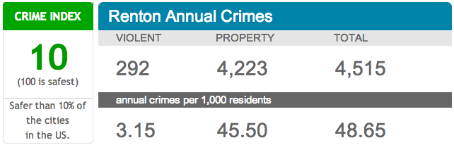
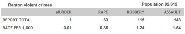
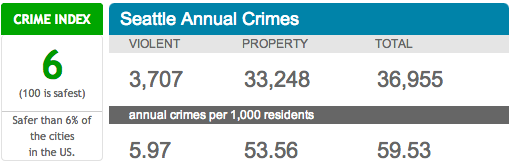
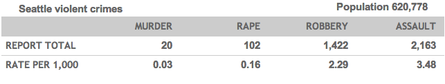
What shocked me the most was learning that the crime rates in Renton are actually lower than in Seattle. Aside from it being a little “rapey”, all the other stats are considerably lower than I expected them to be. If you compare Seattle to Renton, Renton actually comes out safer.

Renton Annual CrimesRenton Violent CrimesSeattle Annual CrimesSeattle Violent Crimes

Being a history buff, my favorite part about downtown Renton is that it is like stepping back in time. The shop fronts on 3rd (which is basically the “main drag” of old downtown), are the same as they were in the 1950s, and not in a bad way. Seriously, this place has everything! Restored old buildings! Original doorways! Sewing machine stores!!! There is something to be said for areas where everything hasn’t been torn down and rebuilt to look like every other place in the world.

This slideshow requires JavaScript.

It’s kitchy and quaint and has amazing potential to be a pretty cool destination.

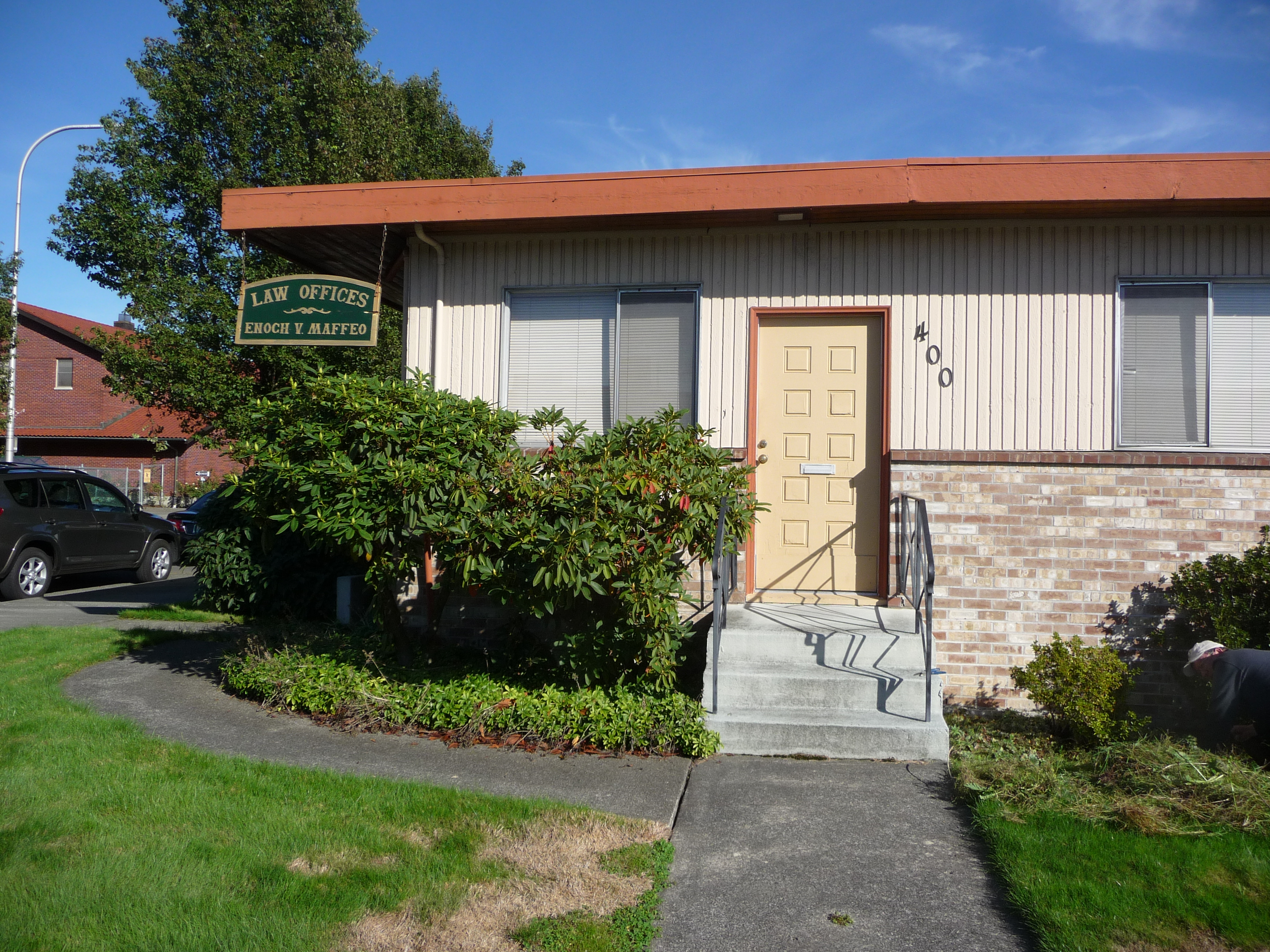
3rd Street borders a very cute residential neighborhood full of war era houses, and some of the houses have been converted into businesses. Having been raised in a small town, I always delight in seeing a law office that looks like this:

Enoch V. Maffeo, Law Office

Anyway, I finally did make it to the Renton History Museum, and it did not disappoint. I arrived in early afternoon, and there was a children’s event taking place in the middle of the museum. Jennifer, the volunteer greeter at the door, assured me that if I wanted to have a look around it would be fine, but I might want to come back after the pirate show had wrapped up. I ventured forth, supplied with pamphlets, hand-outs and a ballot (the museum is hosting a community photography contest, and I was asked to vote) into the screaming belly of the museum. I thought to myself, this is not how I pictured this AT ALL. It was noisy. It was alive.

After the show, parents and children milled about and ate from the platter of homemade cookies that were supplied by the museum. I caught myself wondering: ‘where do these people come from? Surely not gross old Renton’. It was fun and friendly. People were eating. Kids were touching stuff. People approached me and started a conversation. It certainly didn’t seem like any museum I had ever been to before. Then I realized, this is community. This is a gathering place.

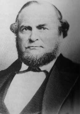
Turns out, Renton has a rich tapestry of history. Like, enough to fill the whole entire book that I brought home. Who knew? I’m not going to go into the history in detail right now, but my favorite fun-fact is that the Art Deco-style museum building is the last remaining structure in the area built under the Works Progress Administration (WPA). Oh, and also, Captain Renton (yes, there was a Captain Renton) was originally a Canadian. BOOYAH. SUCK IT TREBEK.

Captain William Renton (1818-1891), ca. 1875 Courtesy Renton Historical Society

Captain William Renton (1818-1891), ca. 1875
Courtesy Renton Historical Society

I realize I have my work cut out for me. I am swimming up-stream, against a reputation that has been around for decades. But I feel like there are enough residents interested in creating good community in Renton that it can be done. I met quite a few of them yesterday. I am sure that Ian from Rely on Renton (relyonrenton.com) will be a valuable contact, as will be the folks at the Renton Historical Society. My target market will be the community of Renton, I’m basically marketing Renton to Renton. We’re gonna bring out the good! Push out the bad! It’s go time!!

Yes, that's a zombie photo tent. And I've been told that zombie guy is running for office.

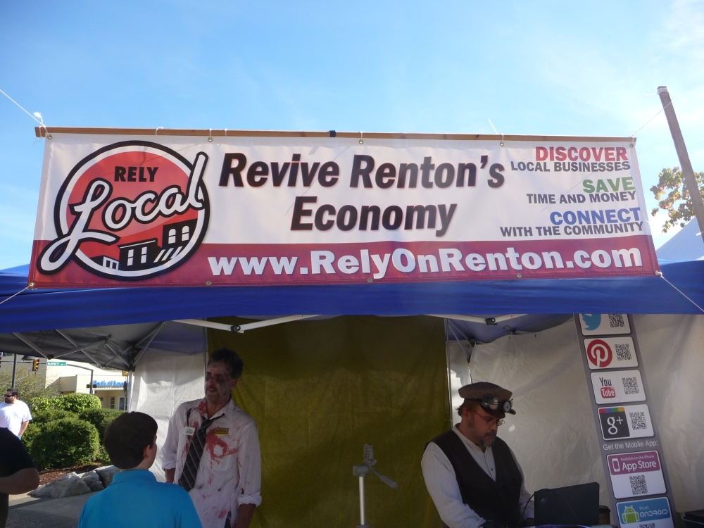
Yes, that’s a zombie photo tent. And I’ve been told that zombie guy is running for office.

River Hog Flapjacks

Introducing River Hog Flapjacks!  This has been the most fun part of my school experience so far — this making up of companies. For my second package design assignment, I decided to do a pancake mix. In Canada, sometimes a pancake breakfast is called a “lumberjack breakfast”, and so I decided to incorporate a lumberjack concept. In my research, I found that “river hog” is a term for loggers that use river water to transport wood, and I thought that sounded like a great name. I wanted to design something hip and sophisticated, something unique that would stand apart from the competitors on the grocery shelves. I opted for a dark color for the box and a modern typeface combined with a more old-fashioned looking script typeface. I even cooked the pancakes and took the photo myself! This was my first time photographing food for a label, and I have to say I was pretty impressed with the results. Thanks to my teacher Tom who challenged me to find the button on my computer that makes things look good.

River_Hog_Flapjacks_Box