If you dissect a bird…

We had an open poster assignment over the winter break and I tried so many different ideas but I felt they all looked weird / failed in some way. This is one of the ideas I came up with. I love Sylvia Plath, and was excited to do something to honor her writing. In the meantime, I will keep working on those other posters and see what I come up with!

Poster3

Fairer Than Death

Last Wednesday, we were given the following (terrific) design exercise. Give it a shot, it was a lot of fun!!

Today’s Graphic Design Exercise by Alex Griendling
It really is quite genius.
He says “I do these as experiments, and use the below formula. It doesn’t matter if the finished design is any good or not, only that I’m challenging myself to think on the fly, and develop an interesting solution to the problem presented.”

Here are the rules:

1 – Go to “wikipedia.” Hit “random” or click
en.wikipedia.org/wiki/Special:Random
The first random wikipedia article you get is the name of your band.

2 – Go to “Random quotations” or click
www.quotationspage.com/random.php3
The last four or five words of the very last quote of the page is the title of your first album.

3 – Go to flickr and click on “explore the last seven days” or click
www.flickr.com/explore/interesting/7days
Third picture, no matter what it is, will be your album cover.

4 – Use photoshop or similar to put it all together. Your finished piece should be 11″ X 11″ trimmed and put on the white board.

You have one hour…..ready, set, GO.

*****

My random article was about Crystal Township, Michigan, and my random quotation was

“Life isn’t fair. It’s just fairer than death, that’s all.”
from the Princess Bride.

For the picture, I chose a photo of a cow from flickr.

Screen Shot 2014-02-05 at 11.36.14 AM Screen Shot 2014-02-05 at 11.38.56 AMFairer_than_death


And here’s my album cover! It was so much fun to make!

Fairer_than_death

Special Topics – Annie’s Sammies

As you may already know, I love sandwiches. I also love cooking for people. Making people sandwiches is one of my favorite things. In fact, now that I am poor again, I have been using my sandwiches as a form of currency in the past few months, and I am not ashamed to admit that I have grown a sort of cult-following of sandwich appreciators (I have at least two major fans, or perhaps even more than two).

So, for winter quarter of Special Topics I have decided to do some more branding. SANDWICH BRANDING!! My favorite kind of branding!! I am going to create a brand for a (pretend) sandwich truck that sells breakfast and lunch sandwiches, homemade soups and possibly some dessert items such as cookies and muffins. To be honest, this is a project that has been taking up real-estate in my imagination for quite some time now. PLUS, this project will tie-in nicely with my upcoming app assignment, where I will develop an app that you can use to pre-order lunches, among a few other things… stay tuned for that part.

My experience with food trucks at lunch time in Vancouver is that I spend most of my break standing in a lineup. The app will allow customers to order their lunches in advance, avoiding long lineup and will streamline the order process. In my research I have not found any food trucks in Vancouver that are currently doing preorders by app.

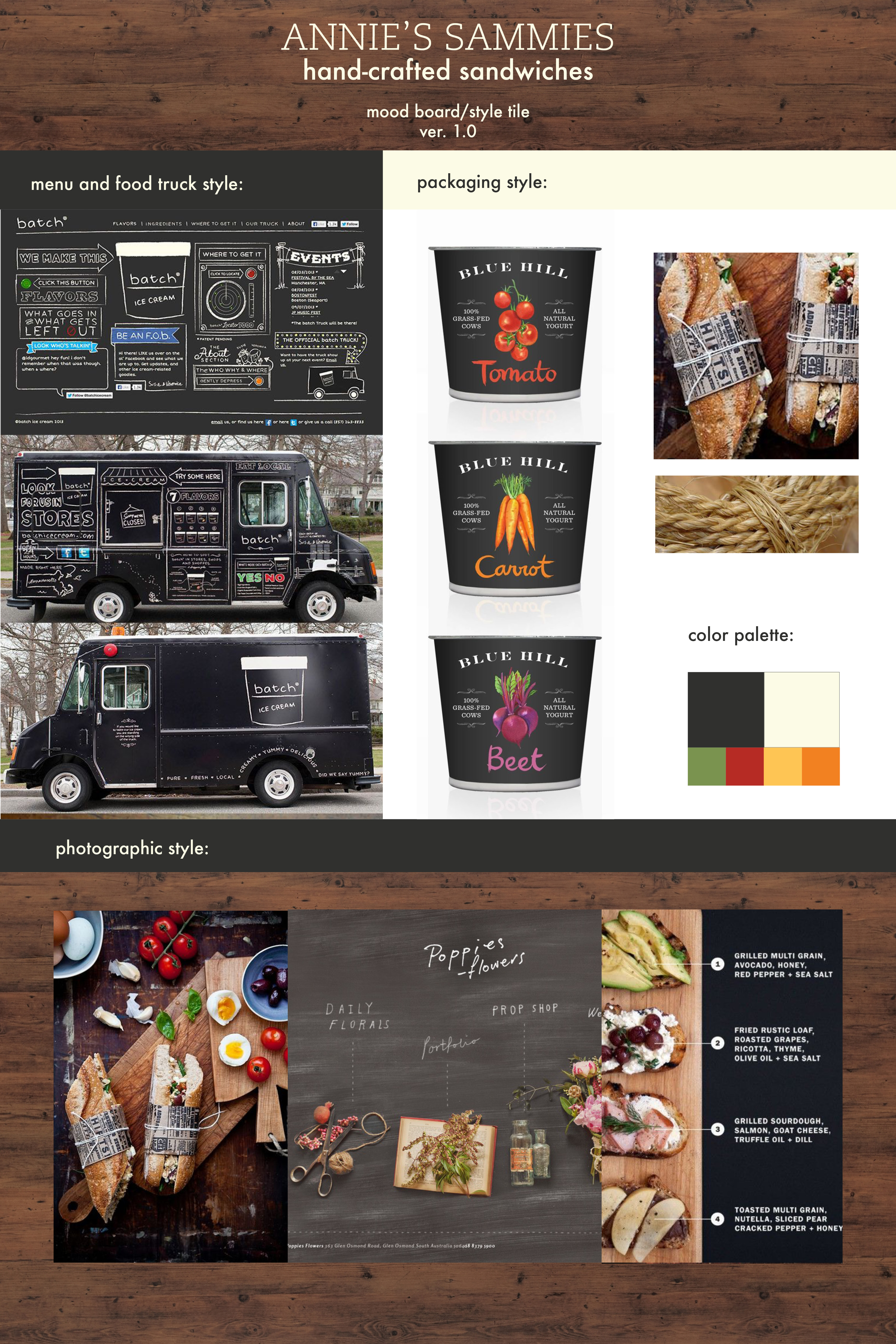
Here’s the first draft of the mood board / style tile for Annie’s Sammies (name subject to change):

Annie's-Mood Board
These style tiles usually go through a series of iterations before I settle on my look and feel for a project, but this gives you an idea of what I sort of want it to look like.

I have written some sample copy for this as well.

Some sample copywriting to further indicate client’s style & positioning:

Not your mother’s sandwich shop. But pretty close.

At Annie’s Sammies, we aren’t gonna pick up your dirty socks. We aren’t gonna clean your room, or do your dishes, either. What we will do is make you a good sandwich. Are you hungry? Good. Let’s eat.

I’m sure your mom would agree that you screw around too much. Don’t get any further behind. Get your food and get on with your day. Your mom will thank you for it. 

Made from scratch sandwiches, crock pot soups, and other warm stuff to keep you going.


What I am aiming to accomplish this quarter:

– logo design
– signage / food truck design
– menus
– sandwich packaging & possibly napkins
– soup containers
– paper bags
– app (for Web class)

You Can’t Get Drunk on Butter Tarts

When a friend of ours from Vancouver, T. Paul, passed away, I hadn’t been to a funeral or memorial in a very long time and I wasn’t sure what to expect. I didn’t know whether it would be dressy or casual. I didn’t know if there would be a formal presentation or if we would just all hang out or what. It took me a long time to get ready that day.

The memorial was hosted at a friend’s home, and the attendees were each asked to bring an item to share. I didn’t know what to bring, but I had never tried to make butter tarts and I thought they would be perfect. I got all the ingredients together and made a huge batch. They weren’t just good — they were a miracle! I felt like a domestic goddess! I was so proud of myself for learning how to make them for the first time! I was super excited to share them with my friends.

On the morning of the memorial, I carefully packed them into a big huge box and waited for my ride to pick me up.

At the time I didn’t own a car, so my friend, Bill McNamara, offered to carpool. I was the last person to get picked up. As I was cramming myself and my huge box of butter tarts between two other people into the back seat of Bill & Diana’s 2-door Volkswagon Rabbit, Bill said, “Whatcha got there, Padge?” To which I proudly exclaimed, “I made Butter Tarts!” Bill raised his eyebrows and without skipping a beat, he said “You can’t get drunk on butter tarts, Padgett.”

Recently, a staff member at my school (who happened to be Canadian) suddenly and tragically passed away. I was asked to bring a dessert item to share at his memorial. The choice was obvious! I had to make butter tarts. I told my classmates the story above and Izzy and Kim made this for me! What a thoughtful and amazing present 🙂

cantget

Renton campaign – Final

We had a lot of fun working on the Renton campaign. Thanks again to Elizabeth Ogle for her awesome help with the photography, cinematography and editing!!

So, without further adieu, I could not be prouder to introduce the final TV commercials for the Renton campaign!


As you can see, I also did a logo redesign using typography and graphic elements that mimic the History Museum building.

Renton Historical Museum

Renton History Museum-logo-white


And here are the final posters…

Chris-BusSTOP-Final

Chris-BusAD-Final


That’s it for now!! What a fun project. I can’t wait to do more!

Generational Health First – Logo revision

At the client’s request, I have completed a further iteration of the final logo, with some small structural changes:


ghf_logo-final


This will have to be all the work we do on the logo for now, as we will be focusing our full attention on building out the website. I have been uploading some content provided by the client and will continue to structure and style the site over winter break. For now, we have been working on the Home and About pages. I am happy with how the homepage is building out so far, but am having a couple of structural issues with the advanced custom fields for the About page. I suspect with a little help these issues will be easy enough to solve.

Styling a homepage from a theme is a big learning curve for me and continues to have its challenges. I knew this would be a challenge from the beginning, but progress has been slow.

Here’s a link to the homepage: leannepadgett.com/ghf

Souvenirs Movie Poster

This is a movie poster I created for ad class. We were asked to come up with a one-word title that was a noun and use photo and illustration. In my brainstorming process I came up with way too many words (I love words) and ended up with a short-list of probably 15. I couldn’t make up my mind which one to use. On the day of class, I decided on the spot that it would be a movie called “Souvenirs” and it would be about hoarders.

SOUVENIRS

I had a lot of fun curating the objects on the “shelf” and coming up with a graphic solution for this poster. Turns out maybe I’M a hoarder because I found most of the items in my junk drawer at home (including the teeth), and the “wallpaper” is a piece of paper I had bought for another project from last year. The composition was photographed together in cool, very late (bordering on too late) afternoon light, using a piece of tin foil as a reflector. I then used Illustrator to manipulate it to look like a painting, and added the finishing touches in Photoshop. I was hoping to achieve a “paint by numbers” look, as if these objects were precious to the collector, but trashy and a little creepy to anyone else, to whom these items didn’t carry the same emotional attachment.

What surprised me the most about this project was the emotional connection I had with the composition. It took me several hours to curate the objects and several more to compose them in a way that I hoped would show the character of the collector. I sat for a long time looking at it and even left it for a day before photographing, allowing time for a few final adjustments. I even told my roommate that looking at this composition made me feel sad. I really hope that sentiment is translated to the viewer.

And here is a “the making of” photo 🙂

ElizabethOgle_LeannePoster2

Renton Campaign – video shoot

Well, we survived our Renton Redneck video shoot! The ads are busily being edited, but I thought I would post a few pictures from the shoot.

The fabulous and terrific Elizabeth Ogle scouted the most amazingly appropriate location that could not have been closer to my original ad comp. When I first showed her the below comp, she was like “hey! I know a place that looks like that!” Here’s a reminder of what we started with:

RentonPoster-M&C


And what we ended up with:

ElizabethOgle_LeannePadgett_RentonRednecks


The original idea was to have a guy and a girl who were playing a couple, but our female actor had another commitment. We thought we would have to settle for one guy for the shoot, but we found him a buddy!

ElizabethOgle_redneck_whitebackground-2ElizabethOgle_redneck_whitebackground-3

The video is hilarious and I couldn’t stop laughing while we were shooting. What a fun time we had.

For now, feast your eyes upon a few stills… video to come soon enough!

ElizabethOgle_LeannePadgett_RentonRednecks-3 ElizabethOgle_LeannePadgett_RentonRednecks-4 ElizabethOgle_LeannePadgett_RentonRednecks-2

ElizabethOgle_redneck_whitebackground-4 IMG_3218 IMG_3221 IMG_3220


Hermit Kingdom Wildfire

Introducing Hermit Kingdom Wildfire!! This is the final version of my layout for the book cover for my Art Direction class. The assignment was to shoot a photo ourselves to present to a theoretical client to show our idea for a book layout. Upon approval of this mock-up version of the book cover, a professional photographer would then step in and perform their magic.

Screen Shot 2013-11-06 at 8.21.36 PM

My hand-drawn type was inspired by 1960s album covers, specifically Whipped Cream & Other Delights by Herb Alpert’s Tijuana Brass, but I also wanted it to have a sweeping, adventurous, western feel. I had so much fun creating this type. I scanned the final inked versions and image traced in Illustrator. I then pasted them as a smart object into Photoshop and applied various effects.

HermitKingdom-author HermitKingdom-title

Cover-Whipped-Cream-and-Other-Delights

My original concept for the photo shoot was to have it be a crazy hippie guy who was on a spirit quest. Here are a few photos which I used for inspiration, followed by another iteration of the cover that I didn’t end up pursuing.

Hunter S-1148200 into_the_wild_chris_mccandless_lancastria_denali_06

Screen Shot 2013-11-05 at 8.48.31 PM

I learned a lot about composition of a photo for layout purposes. Mainly, that many of the photos I had taken were actually no good for a book cover because out of habit I had shot them in such a way that there was absolutely no blank space to feature the typography. Total bummer, because I got some great shots of Dustin in a shopping cart that I wasn’t able to use.

Here are some further iterations of the cover. I quite liked the first one with the bright light of the skyline bleeding into the letters, but felt that there may be readability issues so I opted to darken the type. I then decided to make the type a little bit smaller for the final version.

Screen Shot 2013-11-05 at 7.32.35 PM

Hermit-cover1-2 Hermit-cover1

For the final version, I will probably revise to move the figure into the shot a little more, but I am pretty happy with how the layout turned out and look forward to doing more hand-drawn type.

Renton Abbey

I heard this morning during the Bob Rivers show that the Almost Live folks are back with a show called The 206, which features a sketch called “Renton Abbey”. In keeping with the Almost Live tradition of butchering the hell out of a joke, these are sort of gross and not very funny. However, I decided to include a couple of them here, as it shows the set decoration I hope to achieve with Renton campaign. I pray to the heavenly Gods that my videos will be funnier than this.

We will begin shooting video as well as still shots this weekend. I am looking forward to seeing the results!!